InApp
Designing InApp notifications is straightforward with the InApp Template Editor. This tool enables you to create both simple and interactive notifications, ensuring they are engaging and visually appealing.
Creating a Simple InApp Notification
To create a basic InApp notification, use the default components available in the editor.
Default Components
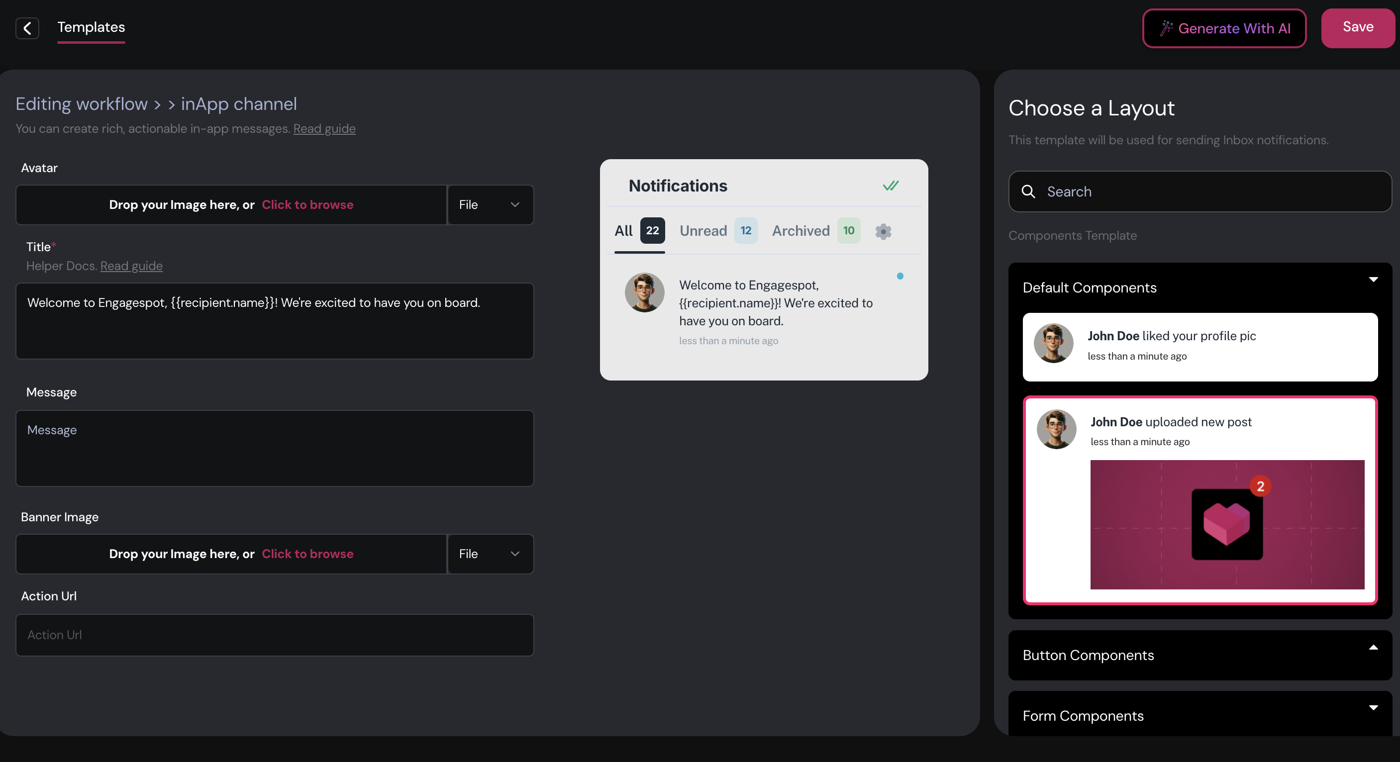
Simple InApp Notification
A Simple InApp Notification includes:
- Avatar: An image or icon representing the sender or notification type. This helps users quickly identify the source.
- Title: The main headline of the notification. It is the only required component and should be clear and informative.
- Message: Optional additional context or details about the notification, providing more information beyond the title.
- Action URL: A clickable link or button directing users to a specific page or action, enhancing user engagement.
Example: For a new feature announcement, you might use a company logo as the avatar, a title like "New Feature Alert!", a brief message, and an action URL leading to more information or a tutorial.
Simple InApp Notification with Image
This variant adds a Banner Image to the default components, providing visual context or highlighting important information.
Example: For a product launch, you could include a product logo as the avatar, a title like "Introducing Our Latest Product," a detailed message, a banner image of the product, and an action URL guiding users to the product page.
Creating Actionable Notifications
The InApp channel supports actionable notifications, which include interactive elements such as accept/reject options or input fields. These notifications are ideal for situations requiring user responses.
To create actionable notifications, utilize the available button and form components. Learn more about actionable notifications here.
Components
Enhance your notifications with the following components:
- One Button: A single button for a specific action.
- Two Buttons: Two buttons, each for a different action.
- One Button with Image: A button accompanied by an image.
- Two Buttons with Image: Two buttons, each with an accompanying image.
- Simple Form: A form to collect basic information directly within the notification.
- Review Form: A form to gather feedback or ratings from users.
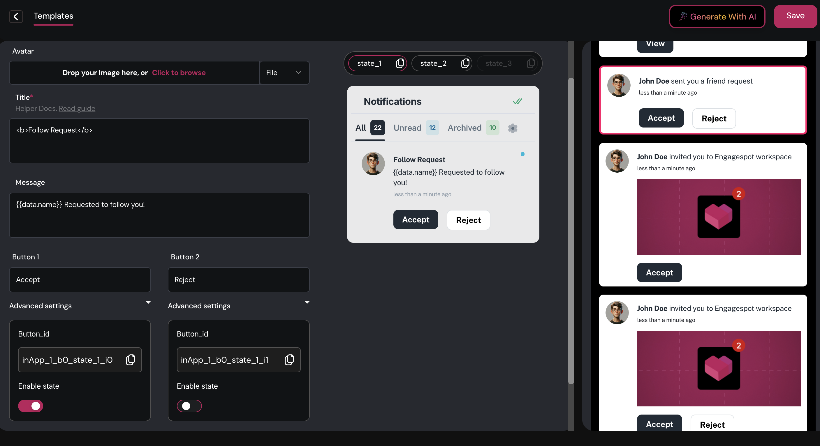
Steps to Create an Actionable InApp Notification
-
Choose a Layout: Select a layout from the dashboard. For example, to create a friend request notification where users can accept or reject the request, choose a layout with two buttons.
-
Configure Components:
- Avatar: Upload a static image or set a variable for the user's avatar URL, which can be passed when triggering the workflow.
- Title: Define the title of the notification, e.g.,
<b>Follow Request</b>. - Message: Add the notification message, e.g.,
{{data.name}} Requested to follow you!. - Buttons: Label the buttons appropriately, such as "Accept" for Button 1 and "Reject" for Button 2.
- For each action button, you'll see a unique id. You can use this id to create event listeners on your front-end application (such as React) to do perform application logic when button click action happens.
-
Enable States: Implement "states" to define the content based on user actions:
- Default State: The initial content of the notification.
- Action States: Additional content reflecting user actions, such as clicking "Accept" or "Reject". For a notification with two buttons, you will have:
- Default: No action taken.
- Accepted: Content displayed after the user clicks "Accept".
- Rejected: Content displayed after the user clicks "Reject".
-
Configure States: Set the content for each state:
- Title: Update the title for different states as needed.
- Message: Modify the message to reflect the user's action, e.g.,
You accepted the requestorYou rejected the request.