Actionable Elements
Engagespot In-App Inbox supports interactive notifications with buttons and input fields. You can choose the layout while creating a template from the Engagespot Console.
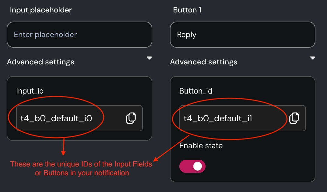
Unique ID of interactive element
Every interactive element, like buttons and input fields, is assigned a unique block ID. You can locate this block ID within your template editor. It's crucial to have this block ID when writing event listeners for the respective elements.
Writing Event Listeners for Actionable Elements
Use the eventListenersToRun property of Engagespot component to define event listeners for any block.
eventListenersToRun={[
  {
    blockId: "<blockId>",
    event: "<supportedEvent>",
    onEvent: ({ event, changeNotificationState, getValue }) => {
      /**
       * For input components, you can read their value
       * using `getValue()` function.
       */
      const comment = getValue("t101_b0_default_i0");

      /**
       * Change the state of notification
       * using `changeNotificationState()` method
       */
      changeNotificationState({ state: "accept" });
    },
  },
]}
Supported Events
| Block Type | Event | Description |
|---|---|---|
| Button | onClick | Fires when button is clicked |
| Input | onChange | Fires when value is changed |
| Input | onKeyDown / onKeyUp | Fires when a key is pressed / released |