Features
Engagespot is packed with useful features to enhance your notification experience, and while this guide highlights the most commonly used ones, you can explore the full range of capabilities in our API Reference Docs.
1. Category Tabs
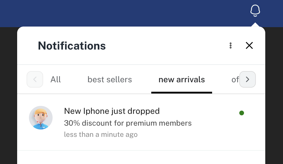
Easily organize notifications by category! With category tabs, users can quickly filter notifications based on pre-defined categories. Set these up in your admin console, then tag messages with a categoryIdentifier to ensure they appear in the appropriate tab. Learn more about categories.

To hide category tabs, set the hideCategoryTabs prop to true.
2. Event Callbacks
Engagespot provides a range of events to help you dynamically interact within your app. Use the events property of the Engagespot component to handle these events. For example, the notificationReceive event fires whenever a new notification arrives, allowing you to attach a callback function to tailor your app's response.
Event types
type EventCallbackMap = {
  notificationReceive: EventCallback<NotificationReceiveEvent>;
  notificationDelete: EventCallback<NotificationDeleteEvent>;
  notificationRead: EventCallback<NotificationClickEvent>;
  notificationSeen: EventCallback<NotificationSeenEvent>;
  notificationReadAll: EventCallback<NotificationReadAll>;
  notificationDeleteAll: EventCallback<NotificationDeleteAll>;
  notificationStateChange: EventCallback<NotificationStateChange>;
};
Example
render(this.$refs.bellIcon, {
  apiKey="apiKey"
  userId="userId"
  events={{
    onNotificationReceive: notification => {},
  }}
})
3. Sound and Audio Cues
Enable a notification chime to alert users whenever a new notification is received. disableNotificationChime can be used to enable the chime, and notificationChimeSrc can be used to set a custom audio file for the notification alert.
Sound Props
{
  disableNotificationChime: boolean; // Set to false to enable chime, default is true
  notificationChimeSrc: string; // Path or URL of custom audio file for chime sound
}
4. Control Panel Open/Close State Externally
For more flexible control, Engagespot allows you to manage the open/close state of the notification panel with external state handling.
Panel Control Props
type PanelProps = {
  isOpen: boolean; // Control panel open/close
  setIsOpen: (isOpen: boolean) => void; // Update panel state
  disableDismiss?: boolean; // Optional prop to prevent dismissal
};
This makes it easy to integrate panel state with your app’s logic, giving you control over when the panel is visible.
5. Custom Notification Content
Render custom notification content directly within Engagespot. This feature lets you design notifications tailored specifically to your app’s look and feel.
A notification item in the center can be fully customized using the renderNotificationBody property, which accepts a callback to return a custom React component, replacing the default.
Sample code for rendering a custom notification item using the renderNotificationBody prop is shown below.
render(this.$refs.bellIcon, {
  apiKey="apiKey"
  userId="userId"
  renderNotificationBody={notification => {
    if (notification.data?.type === 'invoice') {
      // Can pass any html content here
      return <InvoiceComponent />;
    }
  }}
})
For more in-depth documentation and to explore advanced features, check out our API Reference Docs.